Octavia Street Remodel: Project Summary
This project is done!
I'll start with the finished photos because they are beautiful (Whistle photography)
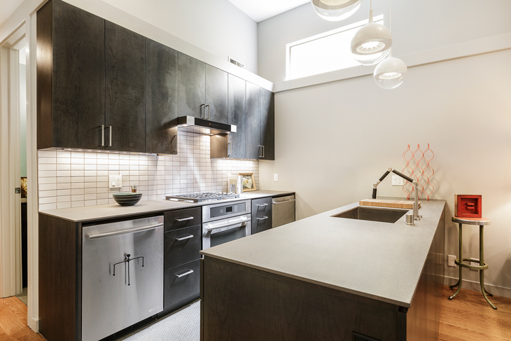
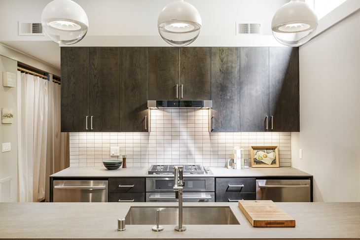
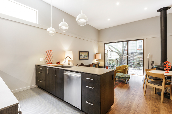
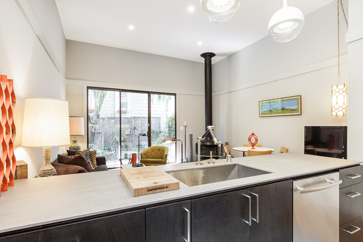
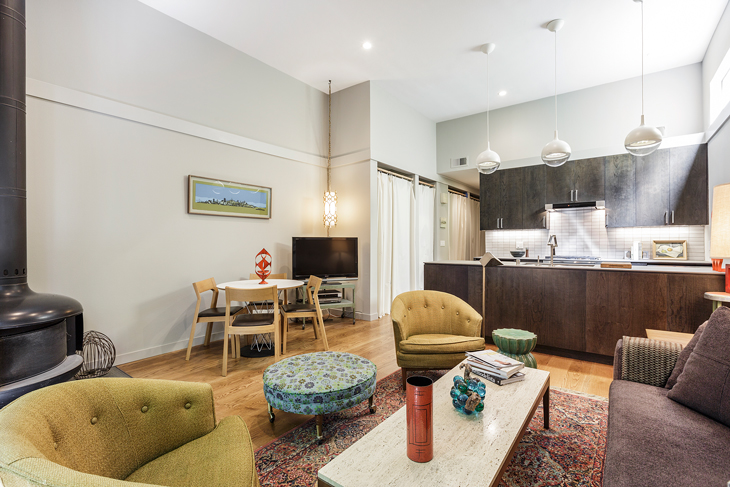
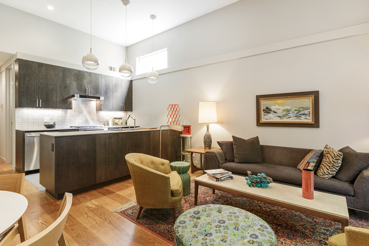
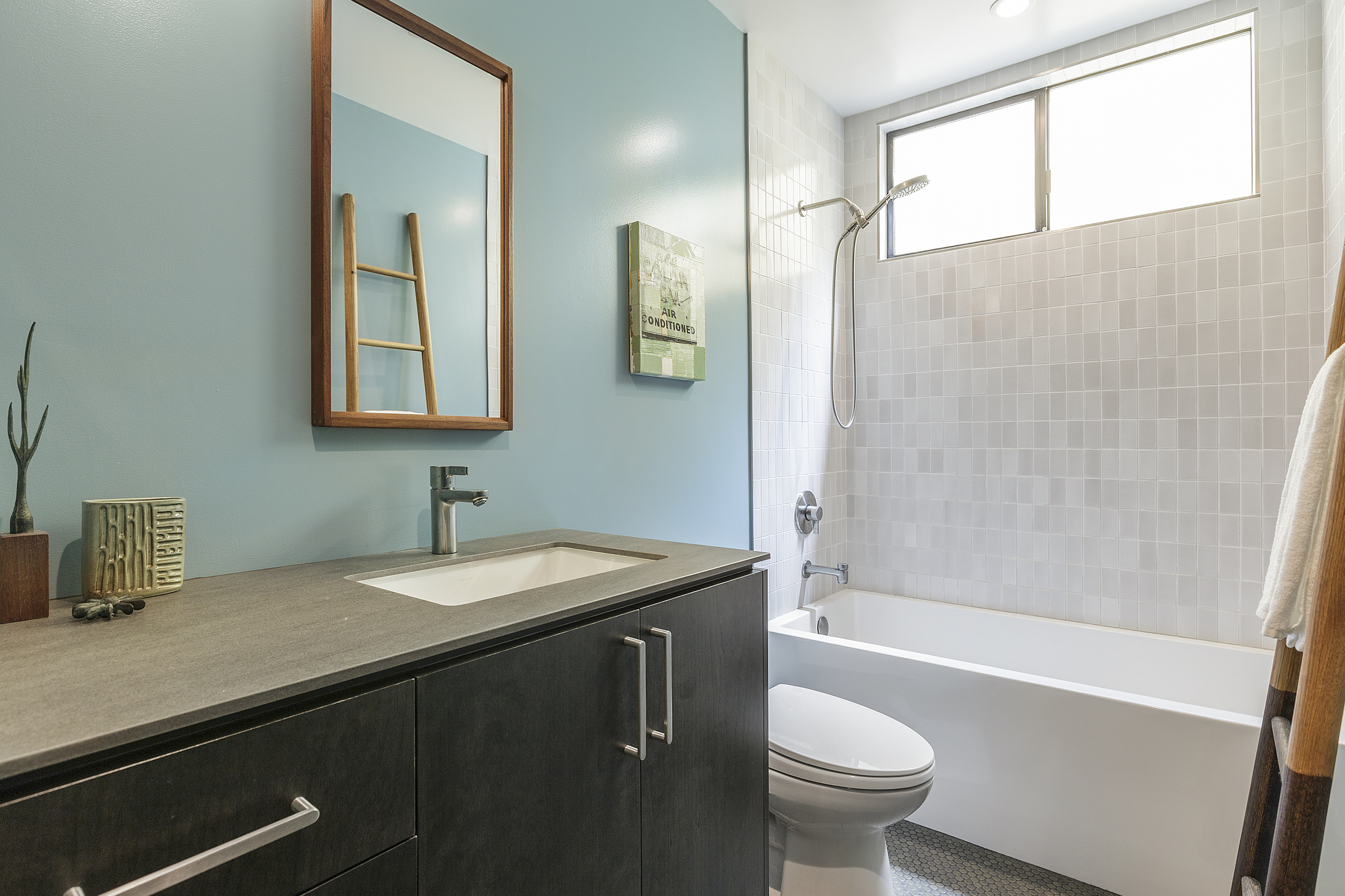
This was a great project from start to finish. A complete finish and fixture remodel, but even though we went down to the studs, we did not move any walls. That's pretty rare for one of our San Francisco remodels, but this is a unique home that was previously updated with a very nice open layout. The fireplace was also added during a previous update and I absolutely love it.
Other cool features include:
the Neolith counters which is a new material. Looks like concrete and is stronger and more durable than granite or engineered quartz surfaces. It also has a super clean installation so the edge matches the cabinet (without the need for a more traditional over hang.)
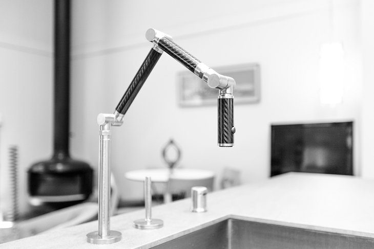
That faucet! This is a Kohler Karbon faucet. LOVE.
The pendant lights + Heath backsplash and shower tiles.
The home owner's awesome furniture + art: I love the colors of the space and the overall masculine feel.
The gorgeous wide-plank white oak hardwood floors.
And lastly, here's the proposed floor plan of the entire space:
It's a nice overall layout. If I could go back in time and re-spaceplan there are a few things I would do:
Put the bathroom between both bedrooms: it's usually preferable to have the bathroom closer to the bedrooms and farther from the kitchen. Moving the bathroom would also allow for a more even division of square footage in the bedrooms.
Push back the kitchen (made possible by moving the bathroom) so that the dining and living space is larger.
Note: I believe the original plan for the front room may have been a family room space, which is why it is so large and has the double doors. That would make more sense because typically you want more space in the public/living areas than in the private/bedroom areas.
I would also recess the appliances into the pantry area for the cleanest possible look

