Chenery Street Remodel: Photos! Remodeled Entry, Hall, Living, Dining and Kitchen Spaces
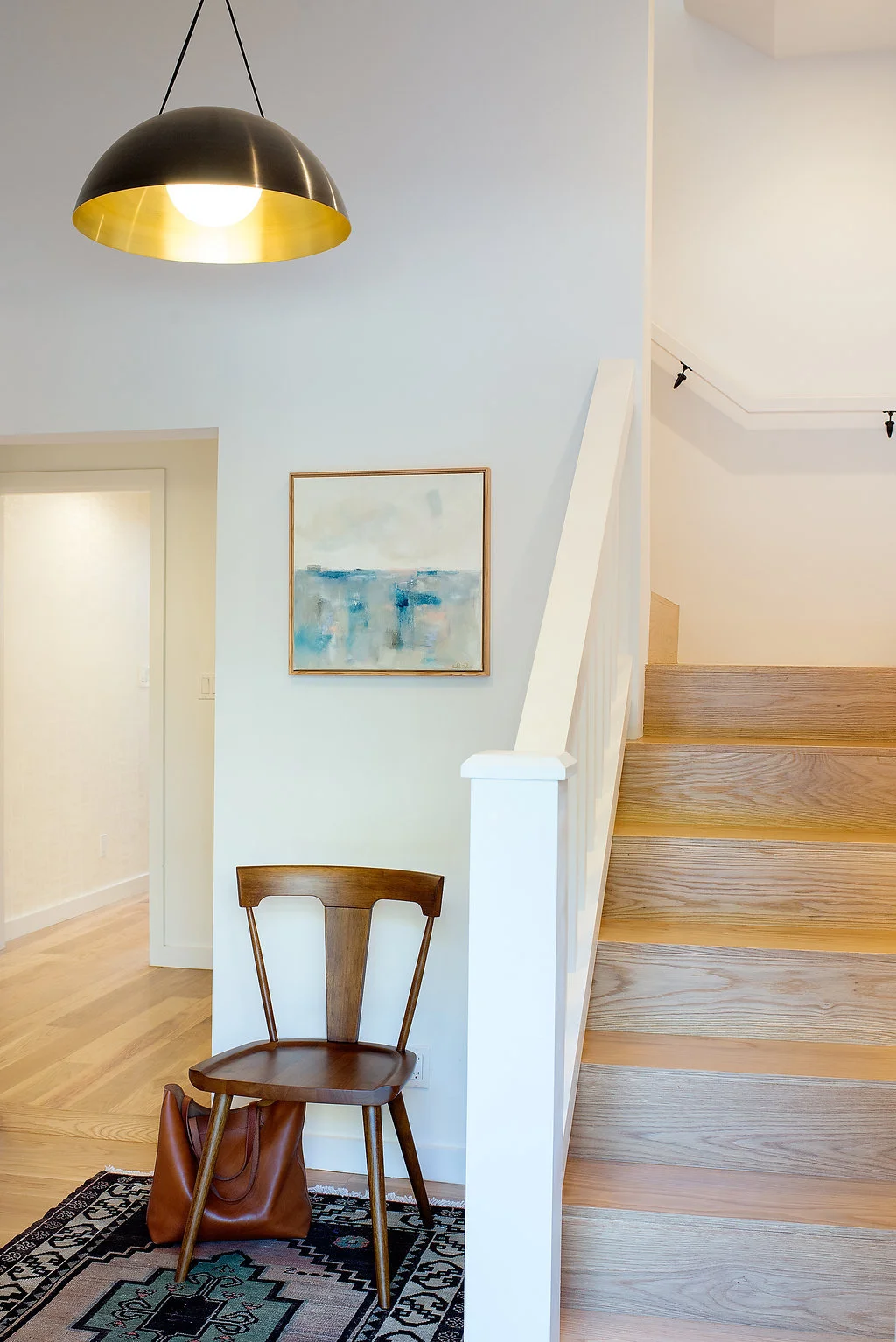
This project wrapped up towards the end of 2015 and we are excited to finally be showing some of the final photos (See previous posts here and here for more details on the scope and planning of this remodel.) The above photo is of the entry foyer area at the ground floor. If you saw what the hallway to the left looked like previously... there were like three different floor heights and materials going on. This ground floor space was not shown much love and felt very hodge-podge, it's really nice to see it so clean and proper looking now!
When you take those stairs up to the second floor this is the upstairs entry area which is the first part of the long built-in storage wall that spans the entire open living space.
Above is a view looking back towards the entry. The farthest opening, where you can see the wood barn door peeking out on the right, is the entrance to the master suite (to the right) and office (to the left).
Btw, how cute is the styling in this photo?! Regan Baker Design spent two full days styling and shooting this home. I am so in love with those colorful little walnut-topped stools.
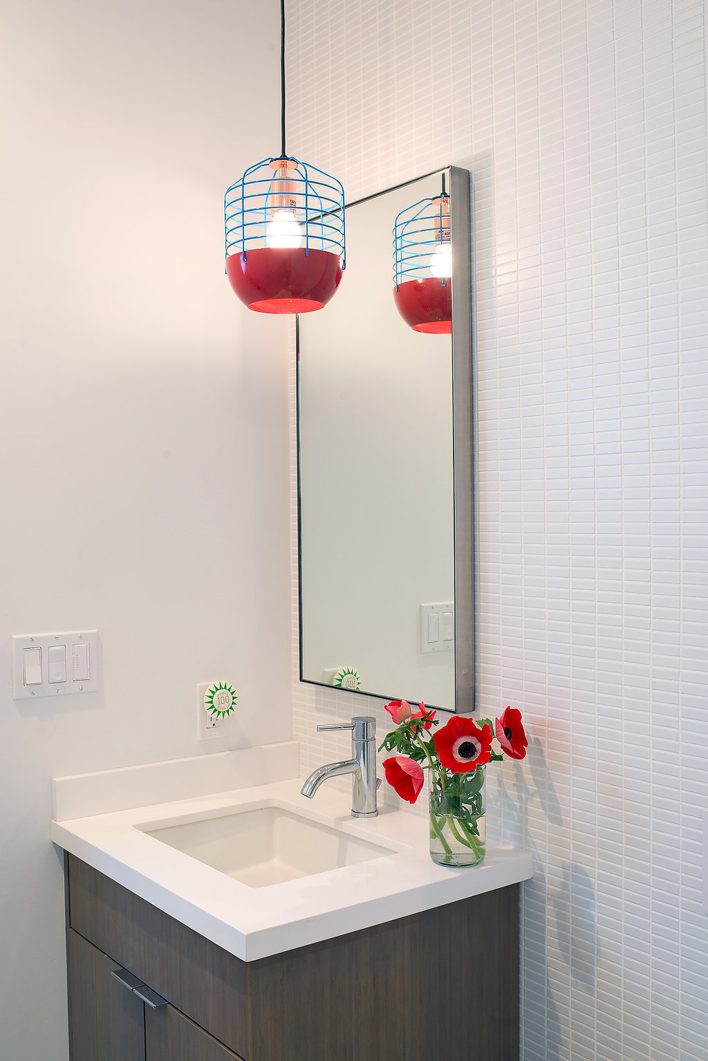
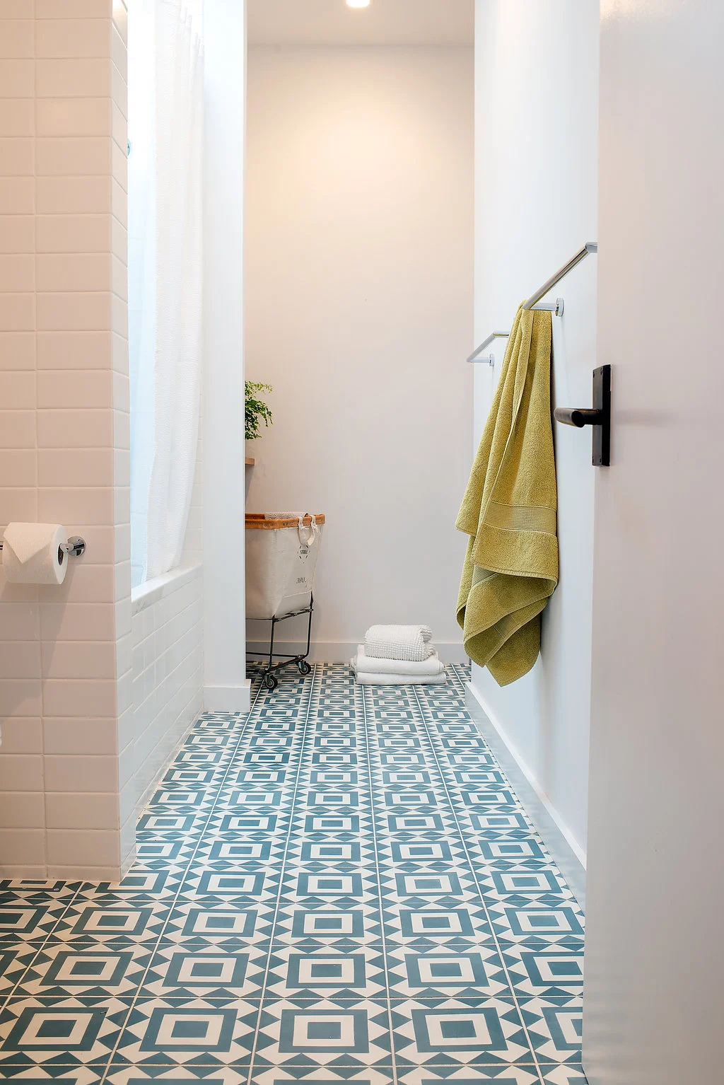
Next to the entry stairwell is the kids/guest bathroom which we wrote about previously because we LOVE that pendant light RBD chose for over the vanity. At the very end of the space (right photo) there is a laundry area which was previously a lightwell. It's so nice to bring the laundry room up to the main floor if you can squeeze it in. We really believe these details are important, especially when you are doing a full house remodel... take advantage of having everything opened up and think about how to make everything as functional as possible!
Above is the middle run of built-in storage that faces the living area and includes a walnut-clad built-in desk.
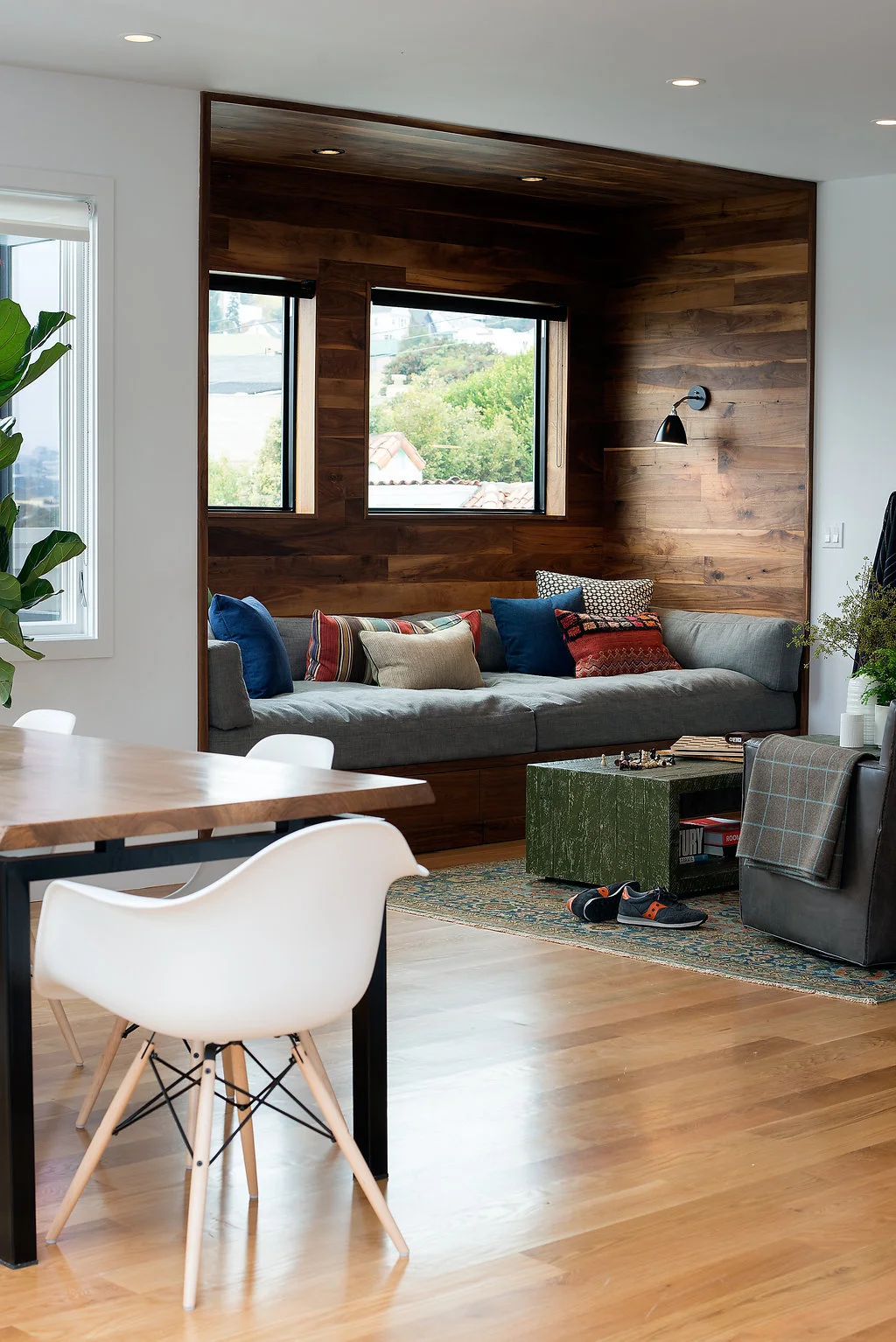
Okay now we've turned around and are looking opposite the desk, at this awesome built-in seating area. How cozy and inviting is this!? This is another area of the home where if you saw the before photos... this was the dinning room and there were these two skinny windows here previously and the bottom half opened up to the fire/parapet wall along the property line outside. A totally different and way less inviting look!
Fun fact: these new windows are actually fire windows. The building code does not allow regular windows within three feet of the property line but with special approval you can install fire windows. Although they are much more expensive then regular windows, it is totally worth it in a beautiful living space like this with city views.
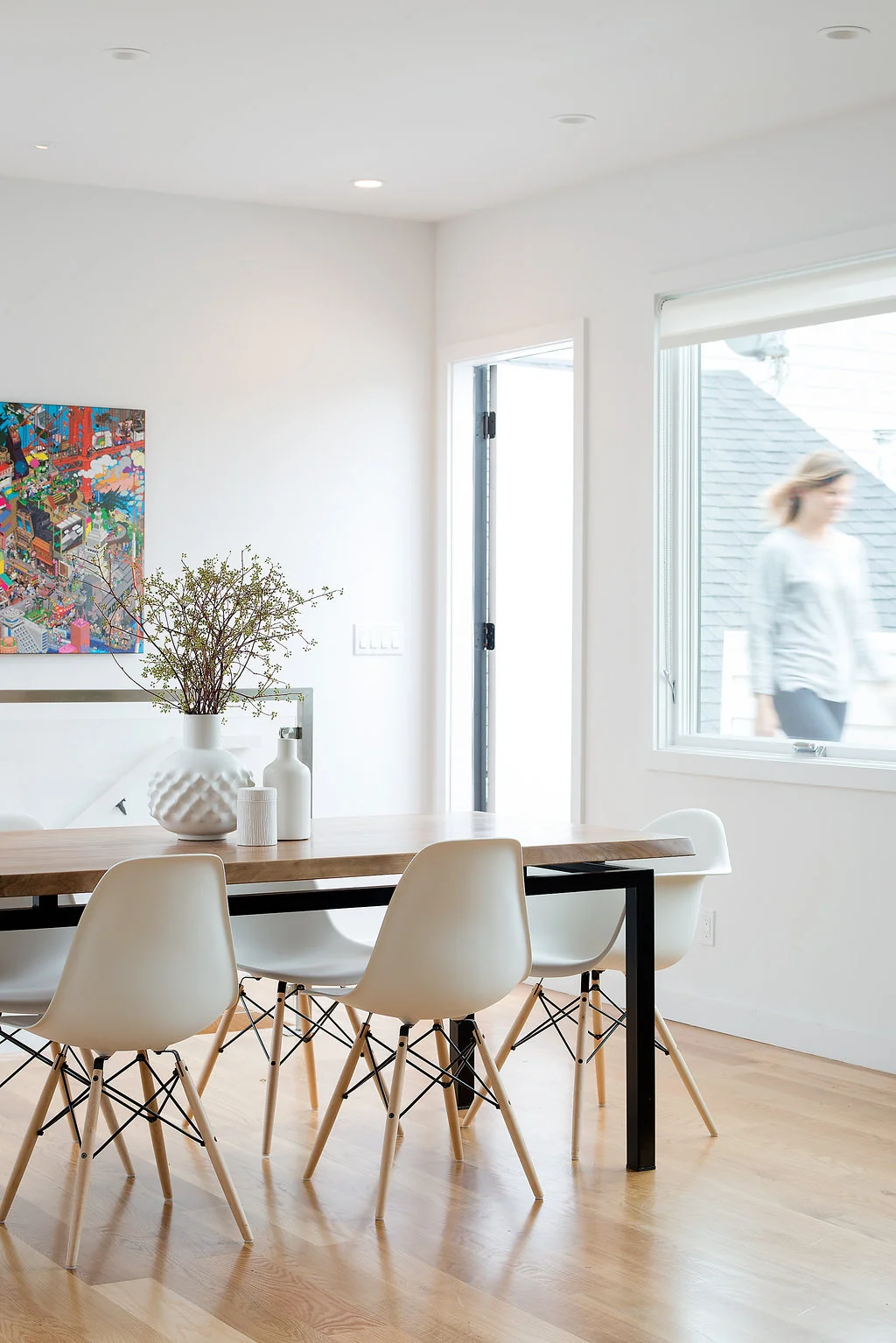
Here we are looking at the living and dining areas from the kitchen. So cozy and clean! Despite all of the windows it still feels really private too. We really love this house.
The dining area is perfectly calm and inviting. We thought about having sliding or bi-fold doors instead of windows... there is this tiny roof deck area outside there. But in the end the windows and slab door were the right choice. If we did do doors instead of windows we would have done glass only on the top half OR full lites but the bottom half frosted to conceal the roof top below. This wall is within 5' of the property line so only 25% of it can have glazing, which means we had to be careful how we maximized that and it was best to focus on the top half of the wall to capture the view. The pair of windows are also consistent with the rest of the home and create a nice rhythm that define each room.
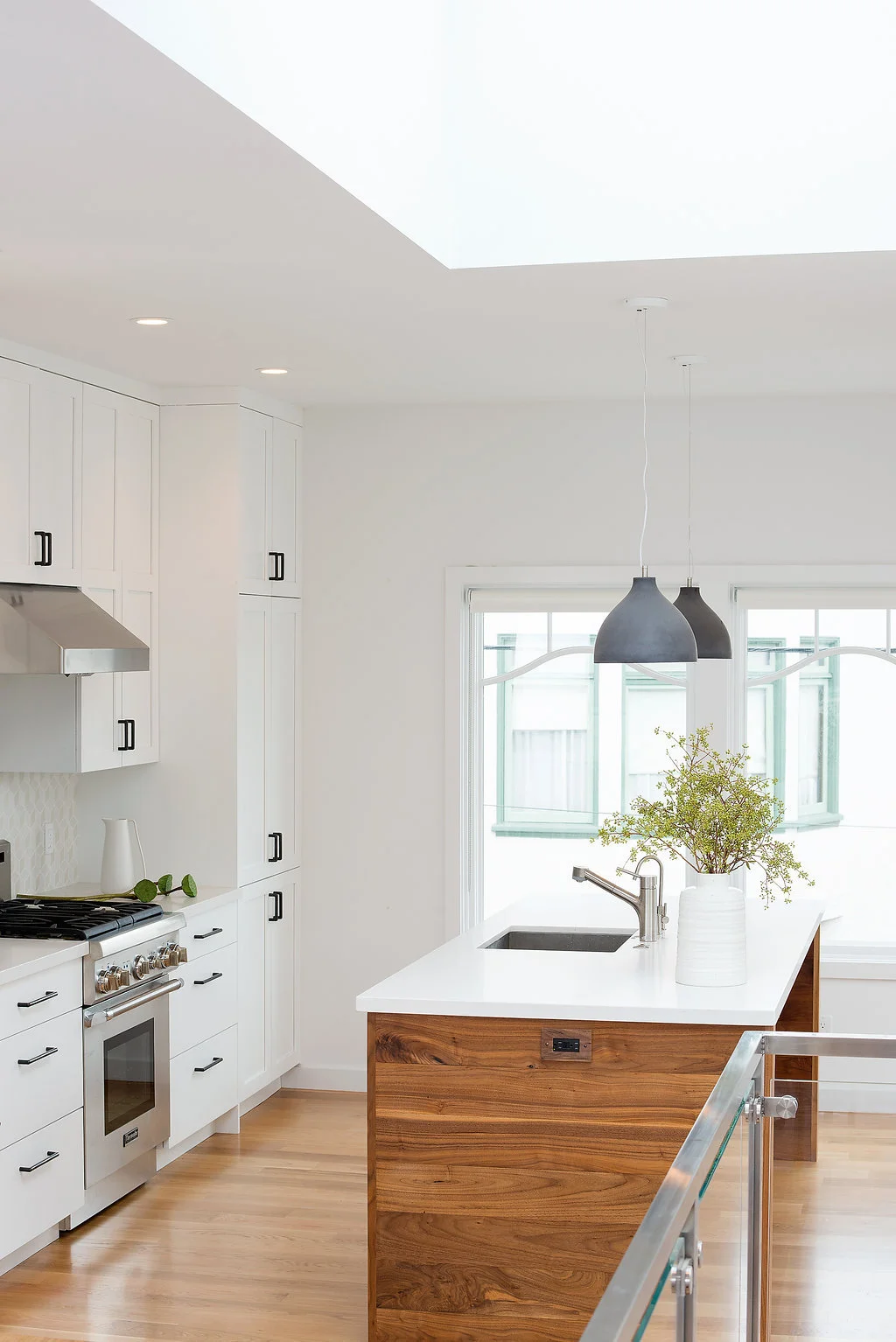
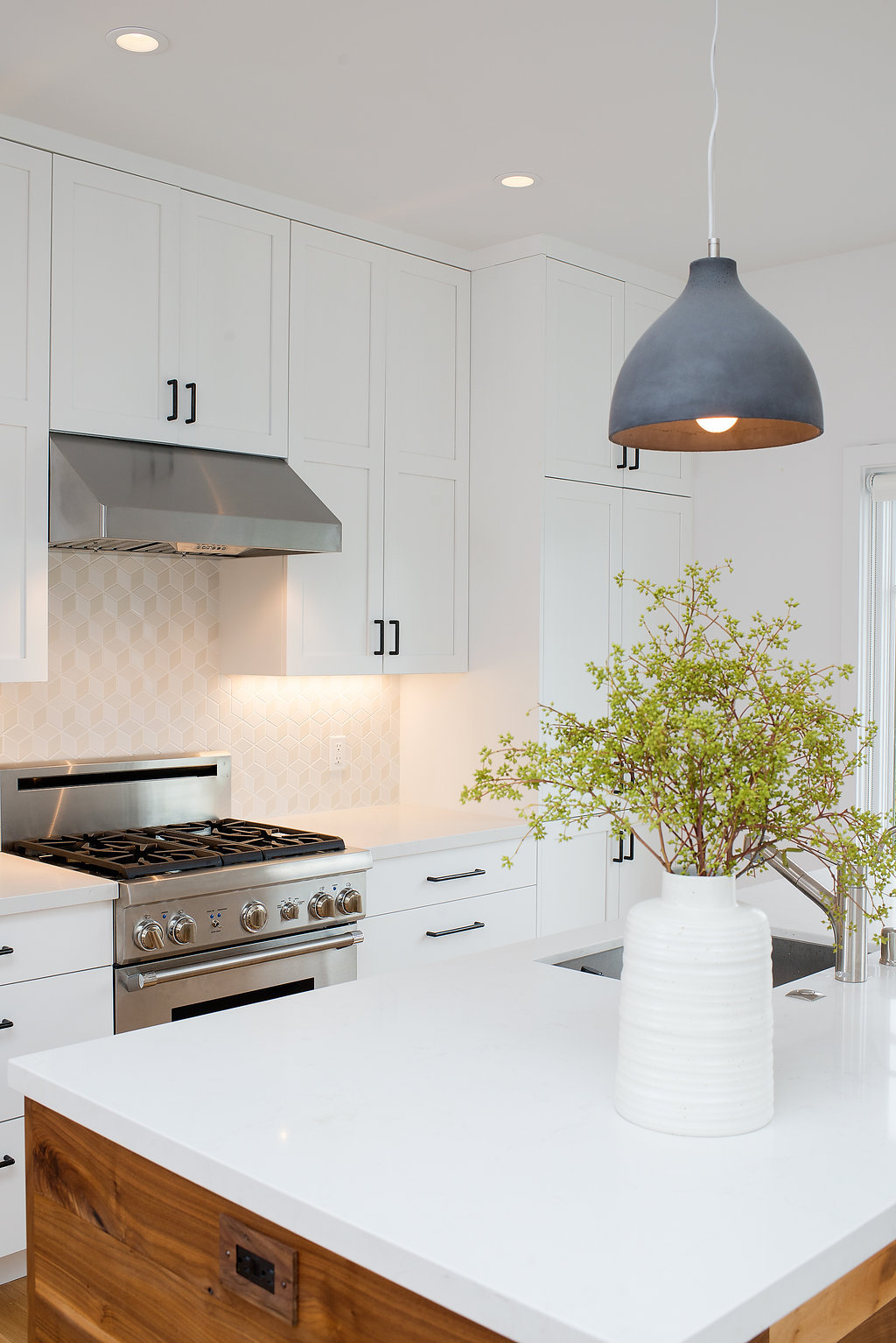
And here is the kitchen which is just around the corner and open/opposite to the dining area. This space was divided up into little rooms before but once we opened it up it was the perfect size for a kitchen. We love love love when everything fits on one wall plus an island. Having the windows and wall space open and with minimal upper cabinets feels so fresh and modern. Way less cluttered than most kitchens. With this layout we find it's best to have one good sized tall pantry cabinet to maximize storage. Also, a very cool existing feature in this home is the huge skylight which you can see in the right kitchen photo. It is massive and lets in lovely diffused light over the rear stairwell to the family room. The more natural light the better, always!!
This post is becoming a bit long so we will break it up and post the bedrooms and family room later this week. If you want to see all of the photos now (or prefer not to read our comments :) then head over to SF Design Build on Houzz.
*Sarah of Modern Kids Co, who is the preferred photographer of Regan Baker Design, took all of these beautiful photos.*

