Chenery Street Remodel: Project Update
The last time we posted about this project was November 2014, almost a whole year! It ended up growing and becoming bigger than expected, which happens often with remodels. And now the construction is finally starting to finish up and the home owners are moving in. The upstairs is pretty much done, except for the windows. We are replacing the beautiful existing wood windows with new custom Marvin's to match and those will be arriving later this week.
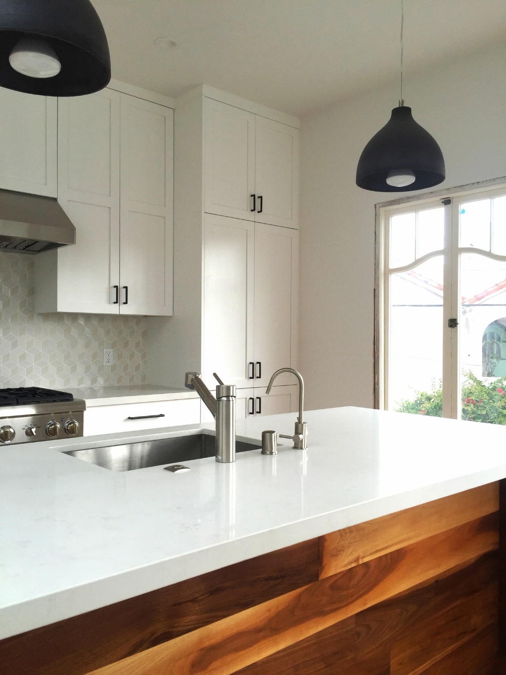
We love how the kitchen turned out. It was originally on the other side of the house, but this location made much more sense. It allows for the open dining and living area to be one big flexible space. Perfect layout for a young family of four.
It's hard to believe now, but when we first stepped foot into this house, it was filled with small rooms and lots of walls and doors. The windows were mismatched and the view was not fully captured. Even with all of the walls and doorways, there were just three bedrooms and one bathroom, along with a kitchen, dining and small living space. The client wanted two kids bedrooms, a master suite and an office, along with a larger living space that captured the surrounding views.
This was one of our favorite projects to space plan and we came up with lots of fun ways to make this space work better (check out this post for more details on that process). One of the coolest things about this house is that it is on a corner and situated in a way that natural light pours in from all sides. We knew we wanted to add larger windows and more skylights to capture all of the different light levels.
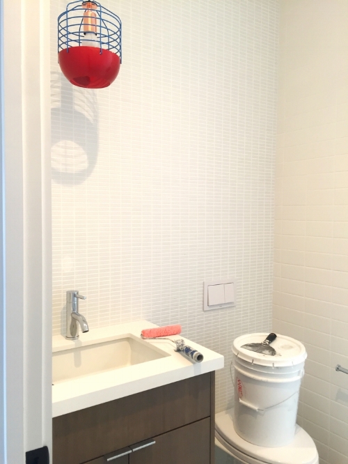
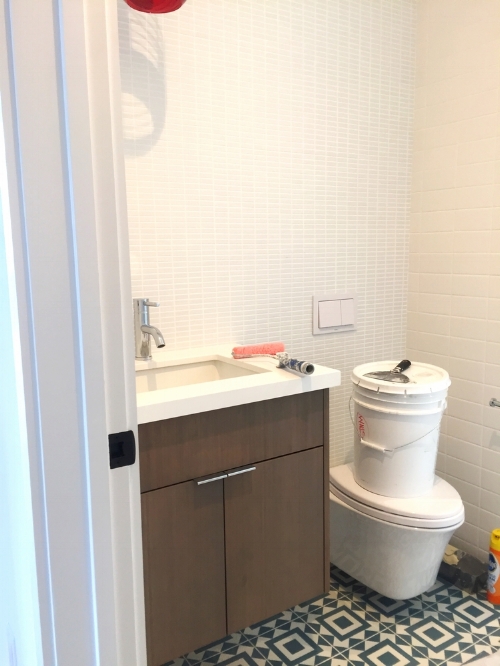
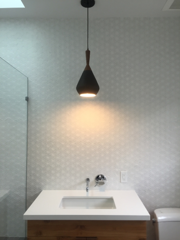
Here are some rough shots of the guest/kids bathroom. We are so in love with that pendant light and how the blue lines play with the blue geometry of the floor tiles. The secret sauce to all of the finish details on this project is local designer, Regan Baker. We love their style!
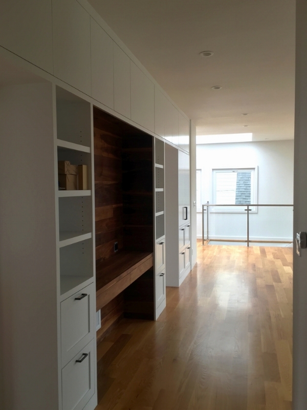
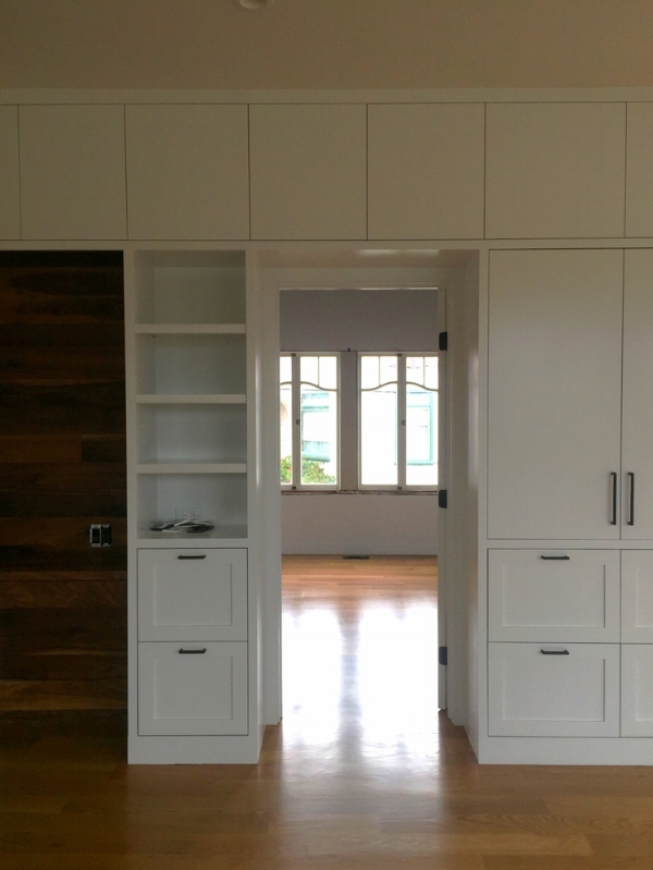
This storage wall turned out excellent. This was added towards the end of the design phase and based on the fact that there was no great place to add a storage room. Luckily this long wall leant itself so well! It extends from the entry/master suite area to the corner of the kitchen and includes entry storage, a desk space with file storage in the middle as well as additional kitchen storage for the end closest to the kitchen/dining area. This doesn't often work in San Francisco because the lots are so narrow it can be hard to widen a hallway enough to add storage. Fortunately it worked perfectly in this home with an unusual lot size and opportunity for a wide hallway.
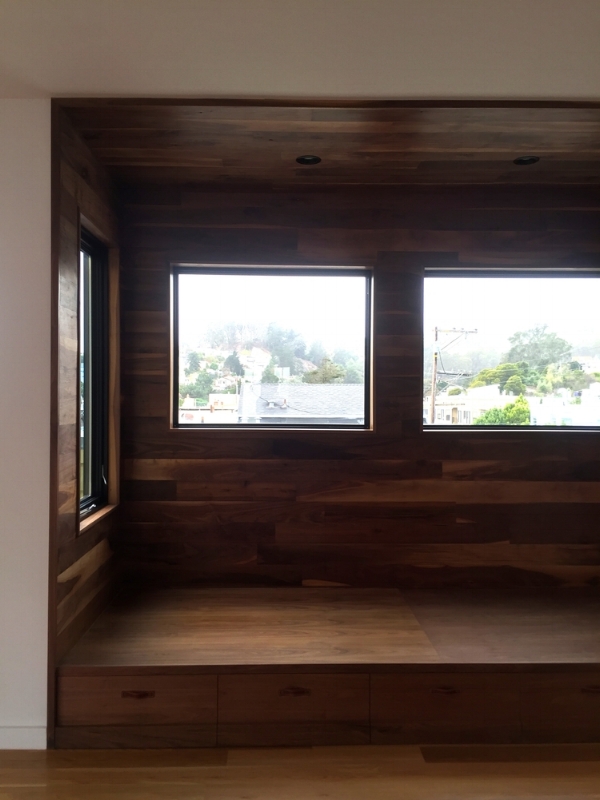
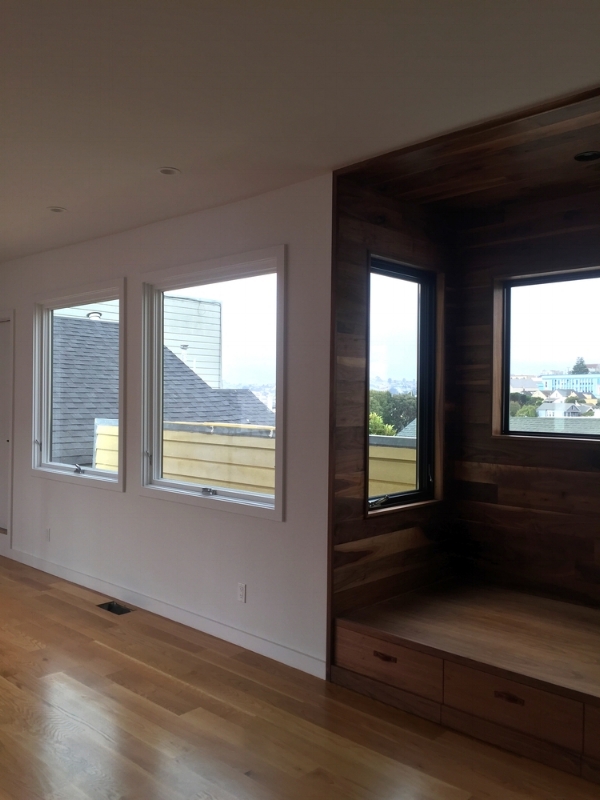
Beautiful walnut wrapped nook (minus the cushions). It all came together so nicely and there were many details involved! From window sizes, heights, trim styles and colors. This was an important element because we wanted to capture the view without highlighting the adjacent rooftops.
Here is a shot of the master bathroom w/ another gorgeous pendant light. We added skylights over each tub/shower which is one of our favorite things to add to a bathroom. Natural light is so important!
You can see from these photos that the overall palette was neutral with lots of white, wood, metals and some gray. We are excited to see the finished space with all of the furniture and design details!

